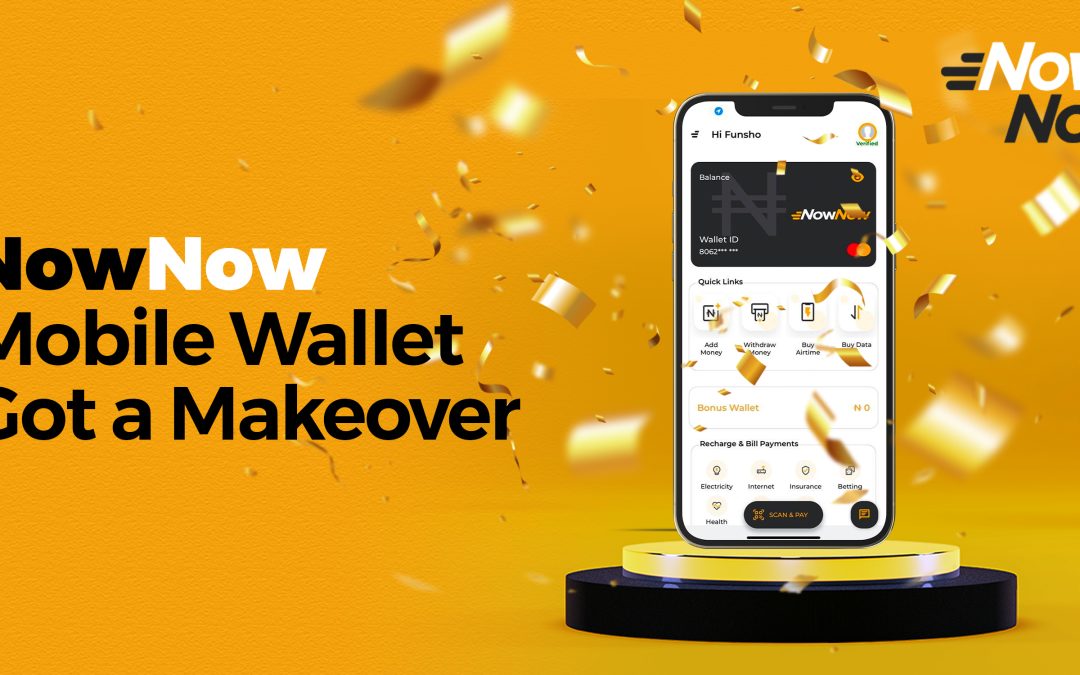
If you are a keen observer, you might have noticed something different when you logged into your app.
That is if you have updated your app in the past 2 days. What’s different you might ask? Drum roll, please…… It now has a new look! makeover! That’s right! We’ve updated the NowNow consumer app. And we are super excited about it.
I’m sure you will too, when you see it. In this blog post, we talk you through our new look and feel of the consumer app design and the reason behind it. What we have done First, we started with a change in brand colors. (Have you seen our jaw-dropping brand new colors). Then we changed the look of the app, all to give you a better experience.
Why are we changing things? We’re growing. In the few years since the NowNow app launched, we have grown in service, users and staff strength. And that’s what we want to portray. We want to show how far we have come to live up to the trust and expectations that you have for us.
The logo changes and the new app reflects how we listened to your feedback to improve the app so that it better suits your lifestyle. We’re evolving. Our key focus is to deliver a more approachable feel to our customers and the expectations they have of us. So expect to see more of the new colours touch on every aspect of NowNow. From things like the app screens, ad campaigns, website, social media pages, promotional items and some incredible projects in the works.

